Época Cosméticos
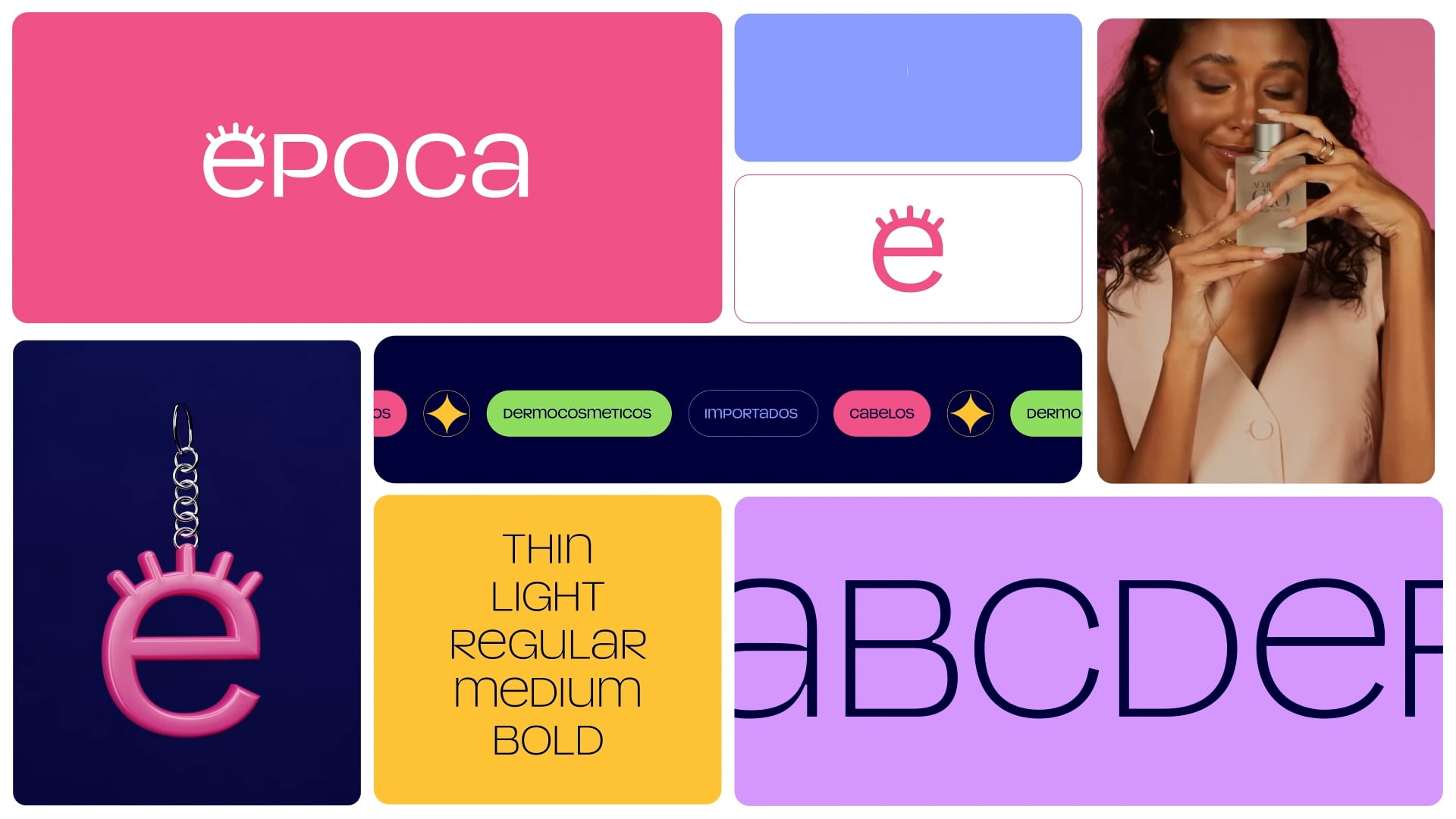
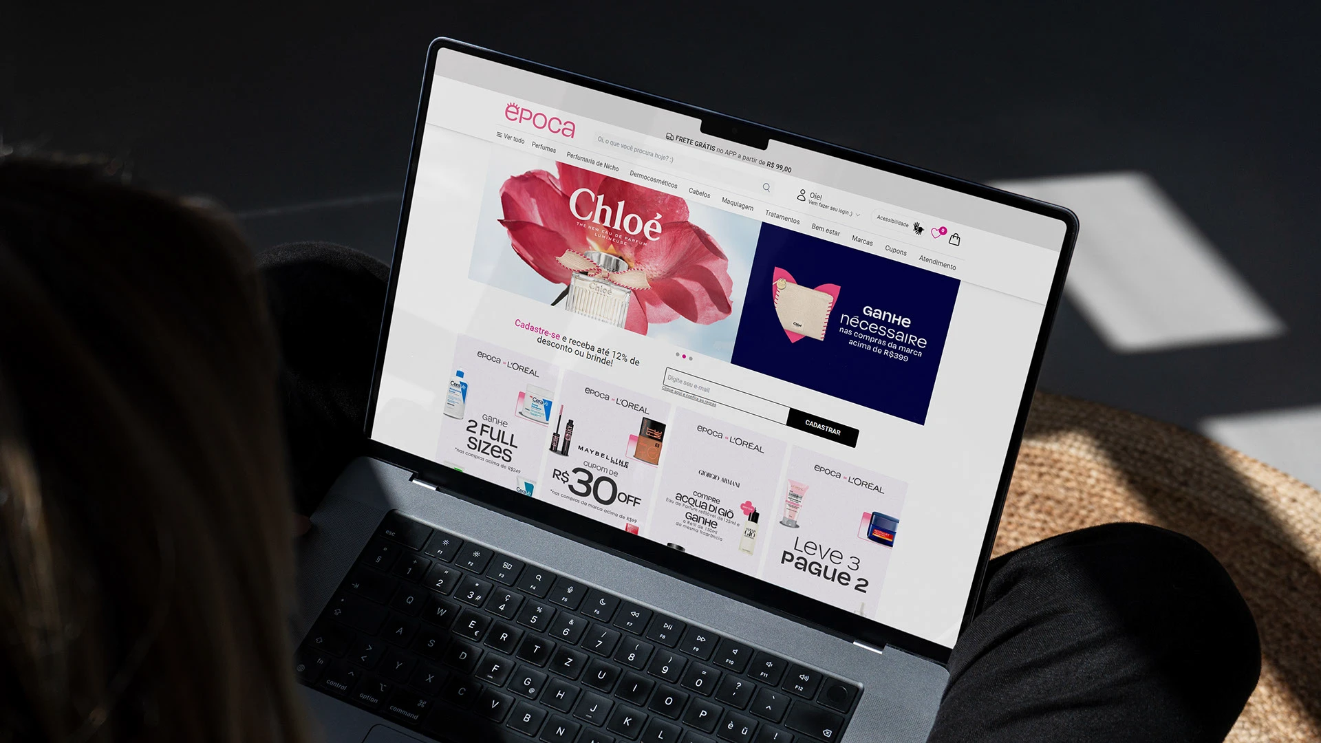
Época is a Brazilian beauty brand and represents one of the largest online retailers in Brazil in the cosmetics segment. From dermocosmetics to skincare, including perfumes, makeup, and hair care products, Época’s catalog offers solutions for every occasion. Their super power is translating the international language of beauty products to the very diverse and tropical Brazilian market.
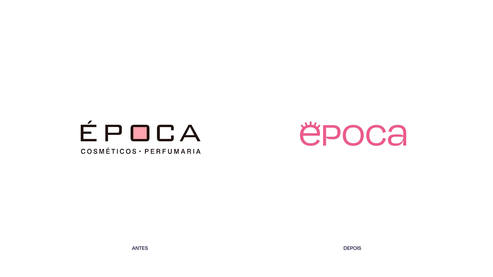
The rebranding arose from the need to update the brand’s visual assets while also expanding its horizons, positioning itself not just as a marketplace but also by maturing its voice to better engage with its audience.

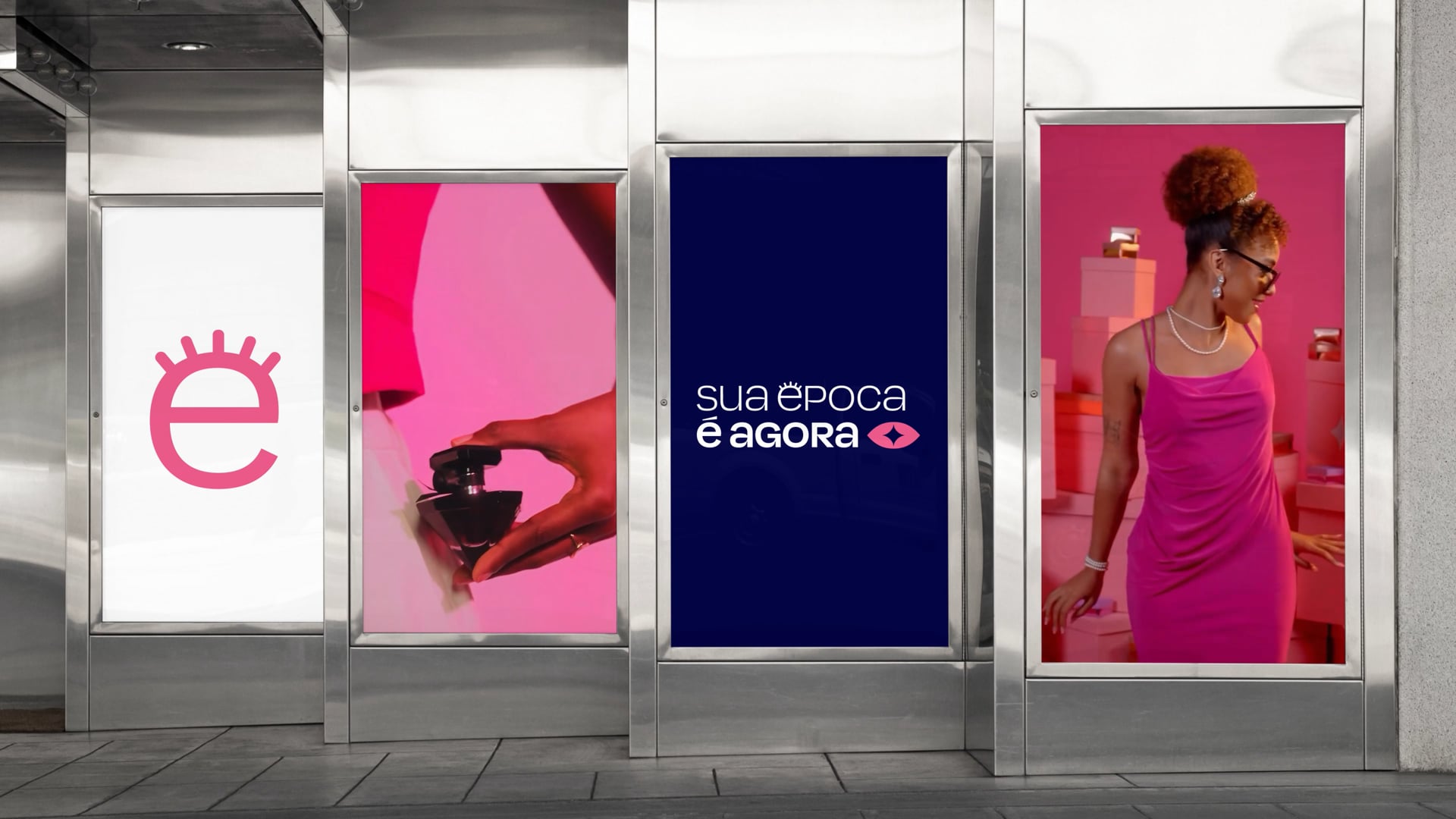
Working together with strategy Benza and Cindy Richa as branding partners and the Época's own creative team, we reached the brand statement "Your best era is now" (in Portuguese, "Época" means era or epoch), which reinforces accessible, achievable beauty—a beauty that people already possess but that Época can help enhance.
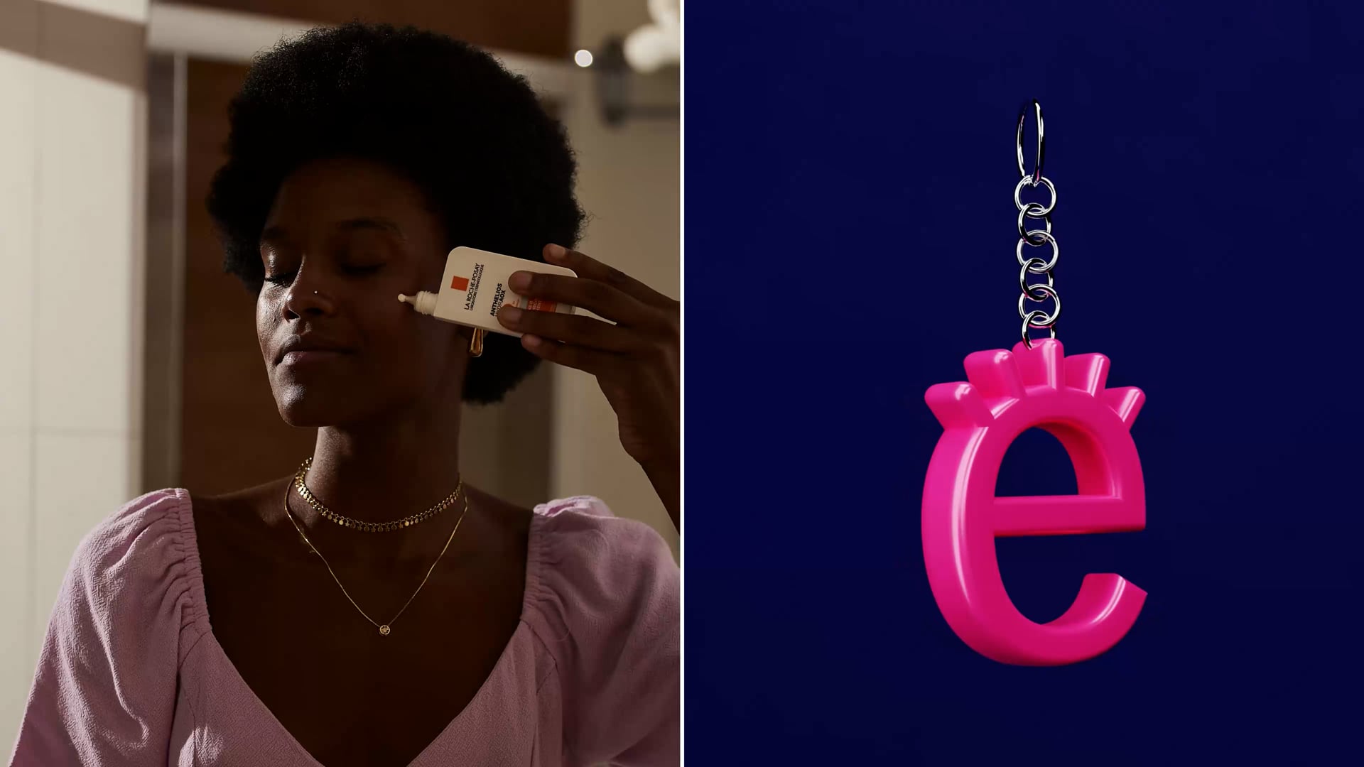
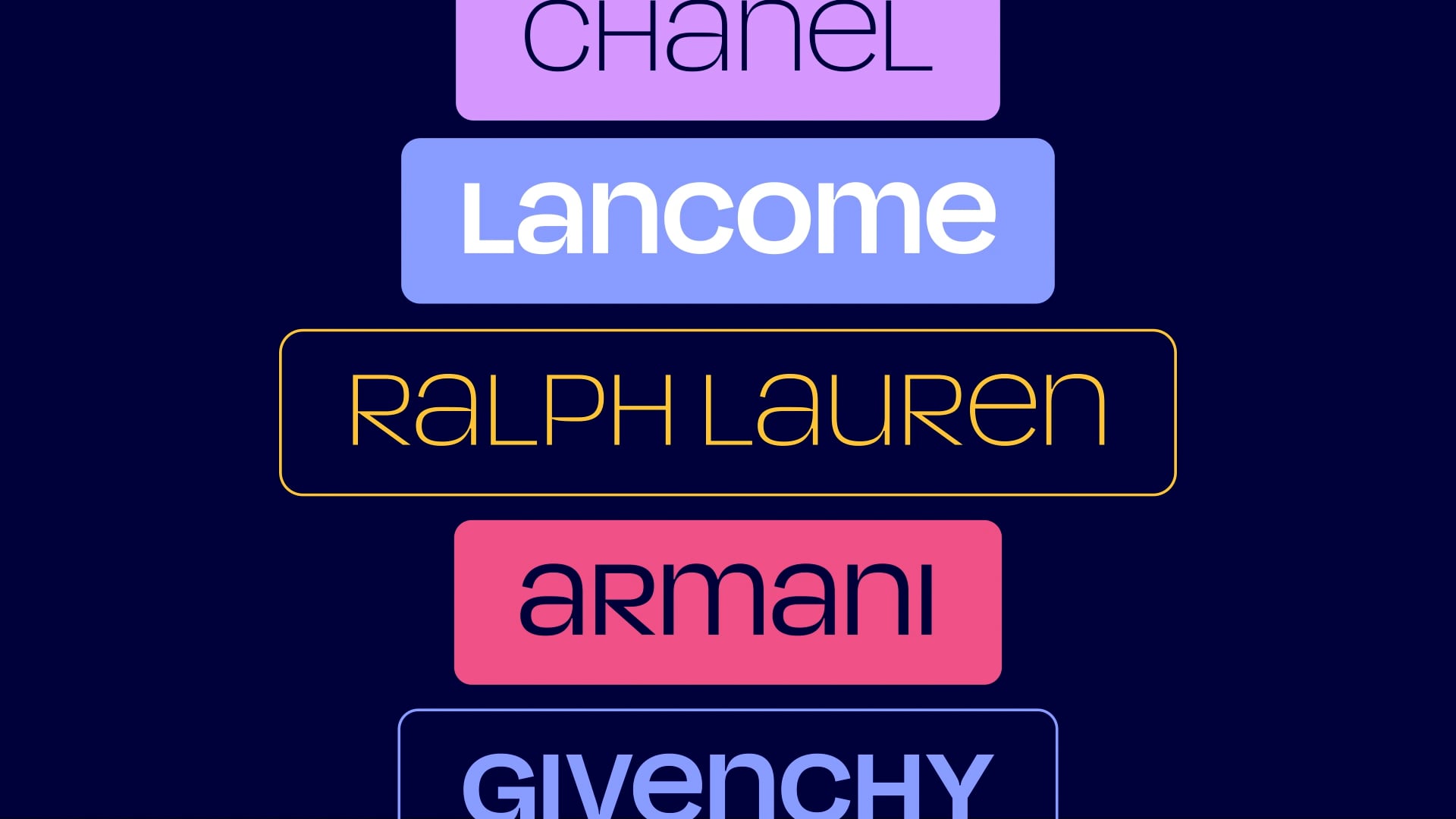
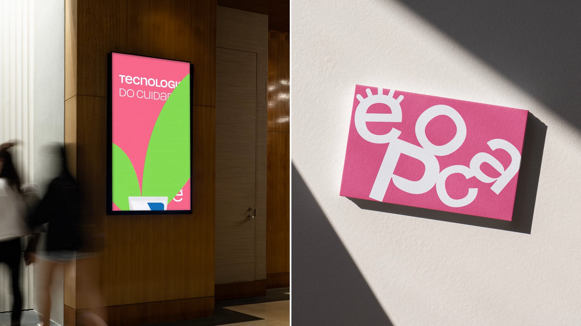
This concept goes hand in hand with another idea we developed for the brand, the "technology of care." Through advanced technology, innovation, and convenience, Época ensures that everyone is well-served and can find what they are looking for on our platform. It facilitates access to international products, which are sometimes out of reach and distant, through inclusive, light, and friendly communication.

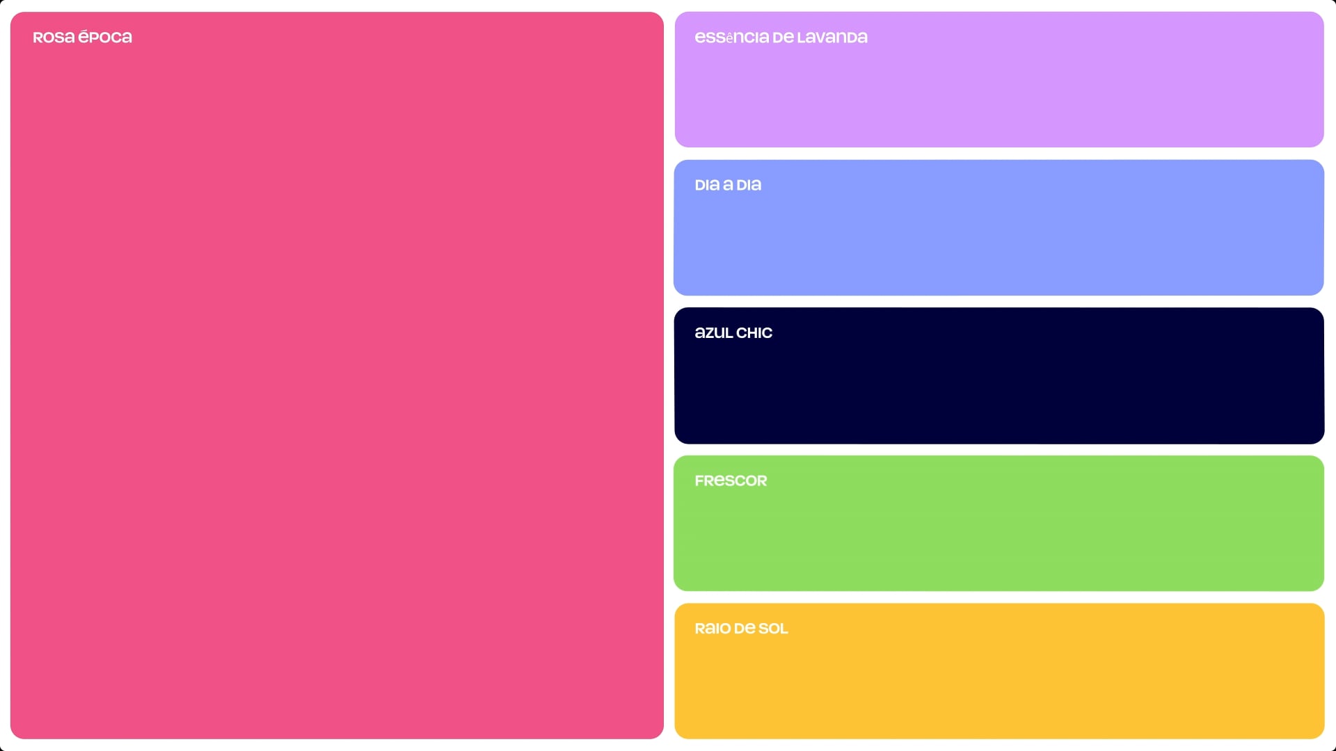
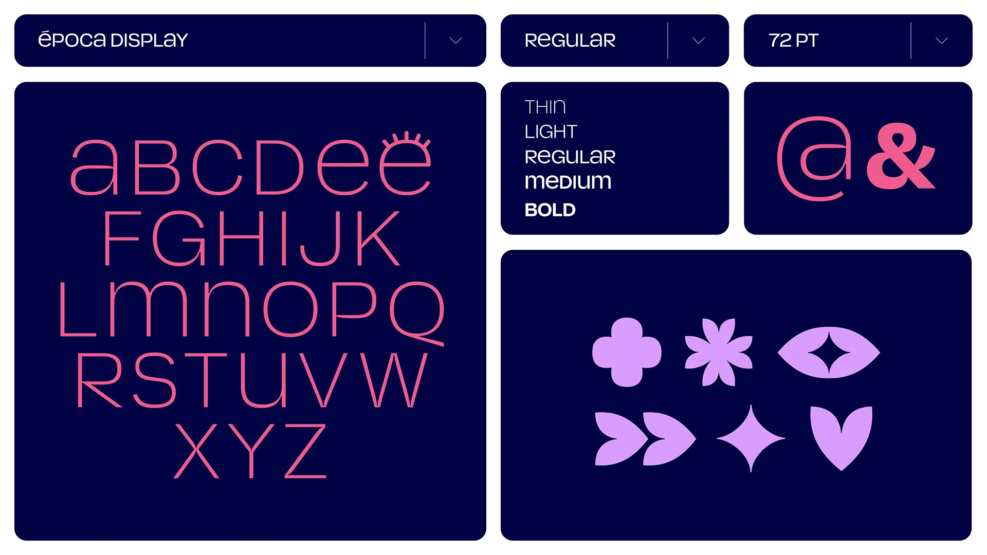
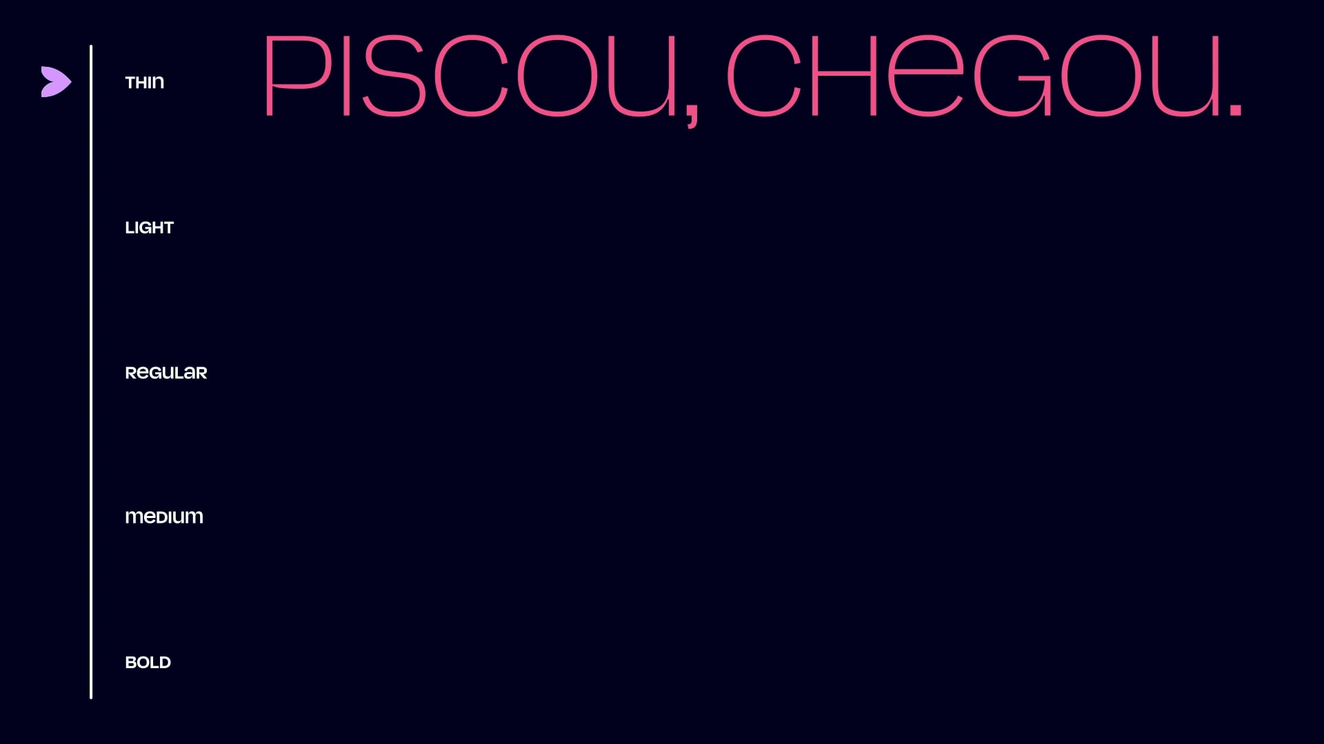
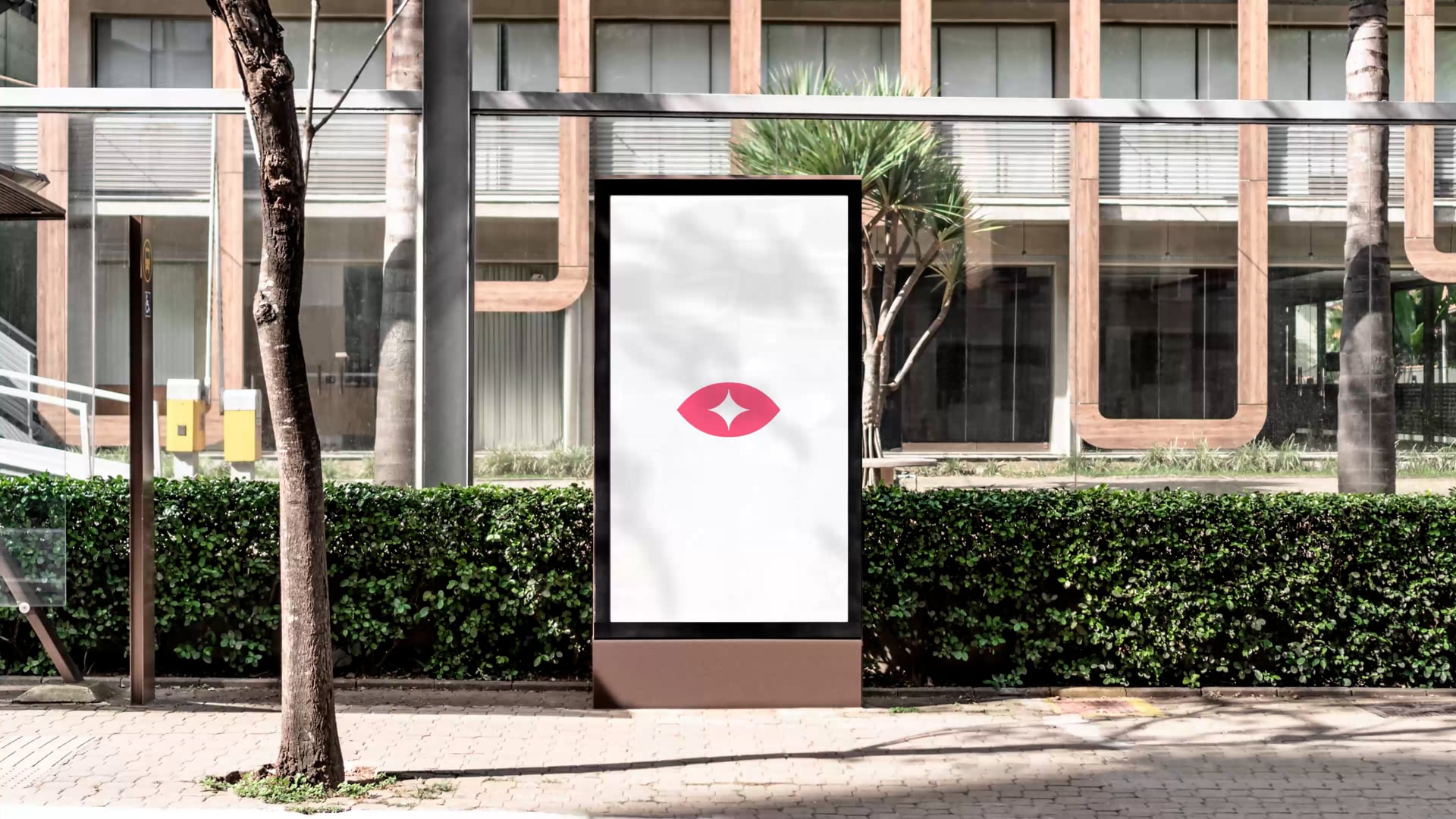
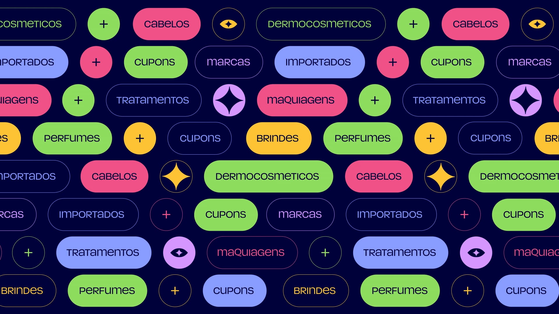
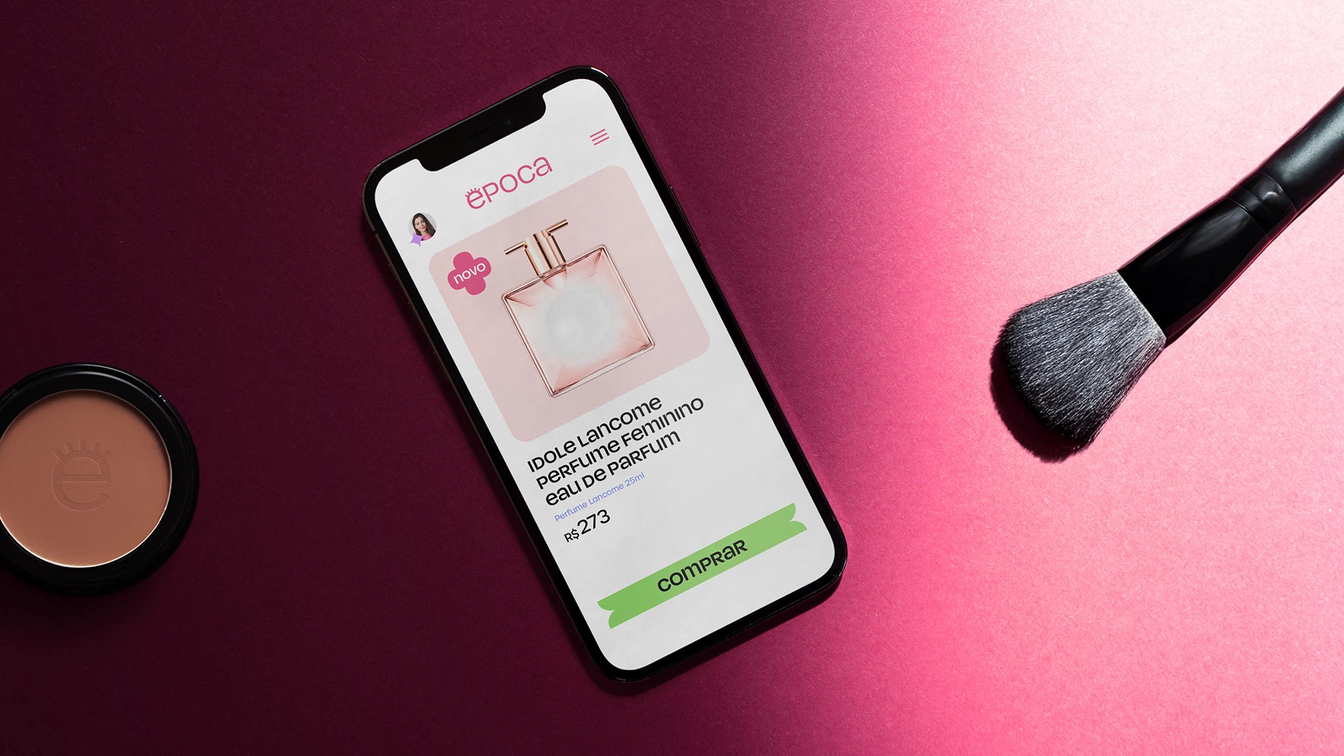
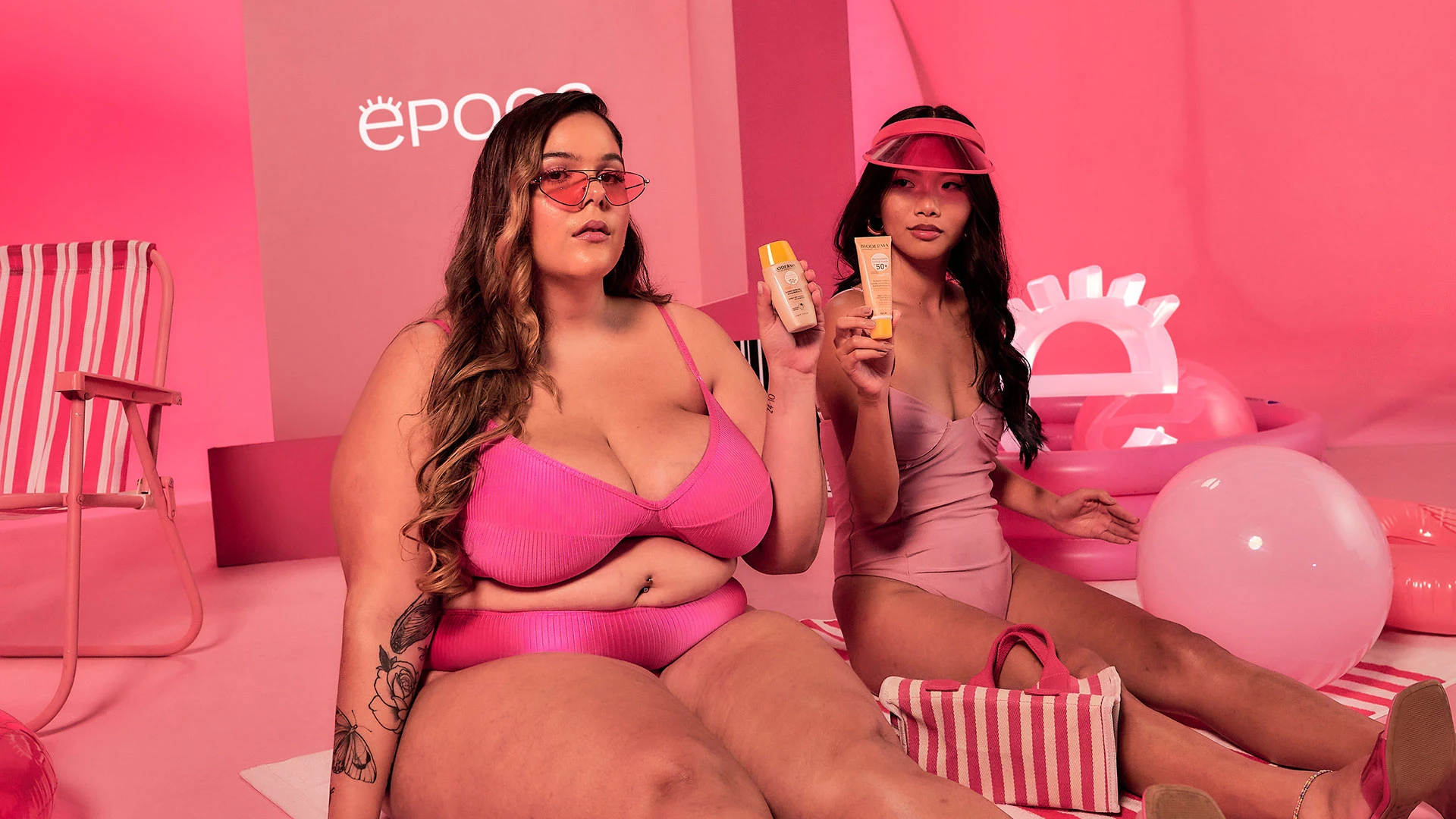
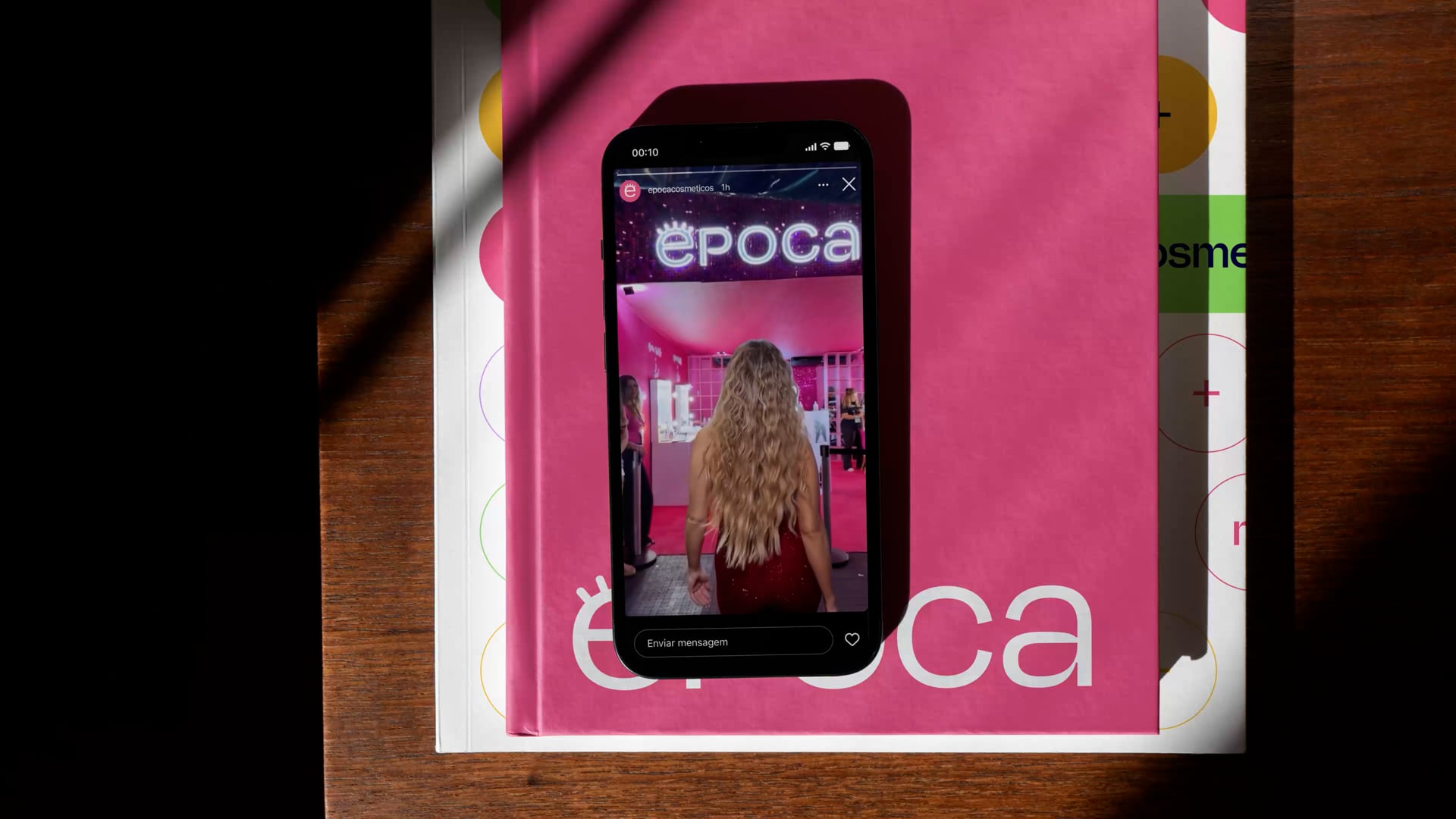
We had the opportunity to work with the brand in its entirety, from strategy to graphic design and type design with a custom typeface. The new Época is more vibrant than ever. We didn’t hold back when it came to "expressiveness." The colors are diverse and energetic, the graphic elements visually translate the brilliance of Época's beauty, and the typography communicates with enthusiasm.
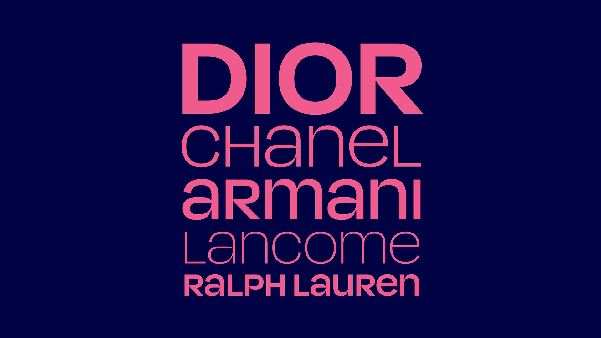
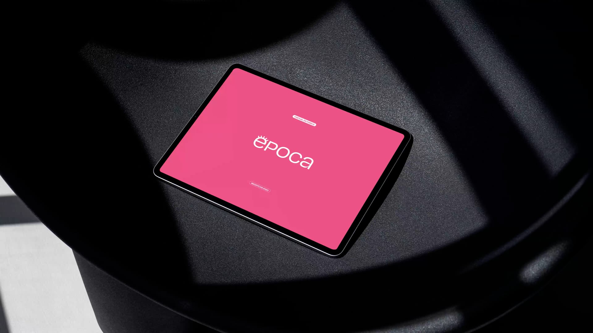
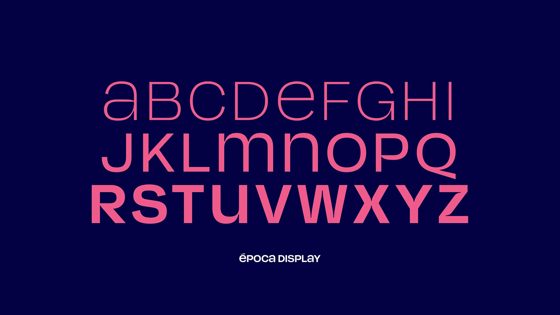
Época's typeface is an unicase, meaning it combines uppercase and lowercase letters at the same height, a feature that adds dynamism to the design, a feature also seen in the logotype.
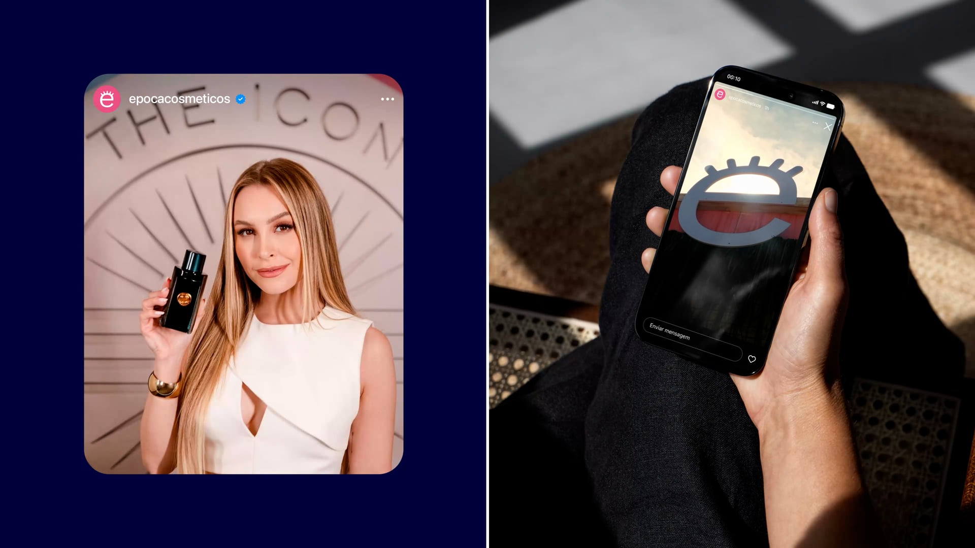
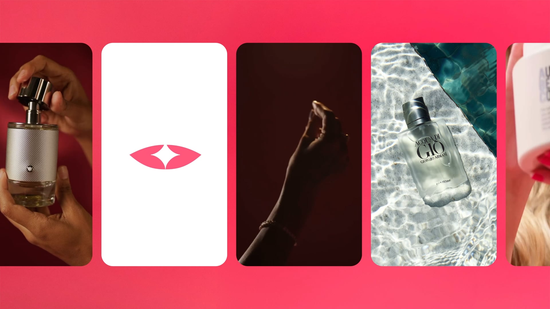
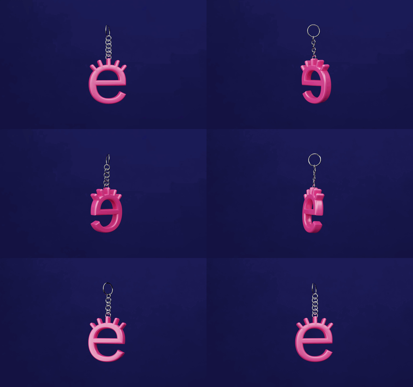
This rebranding project elevates Época to communicate as a beauty expert, not just a space for buying cosmetics. Now, it reaffirms its position among the giants of the Brazilian market.