Jappa da Quitanda
- Scope
- Brand strategy, identity & custom type
- Sector
- Japanese restaurant
- Studio
- Plau
- Recognition
 Featured in Behance’s Branding gallery
 Featured in Behance’s InDesign gallery
- Project
- 04 / 12
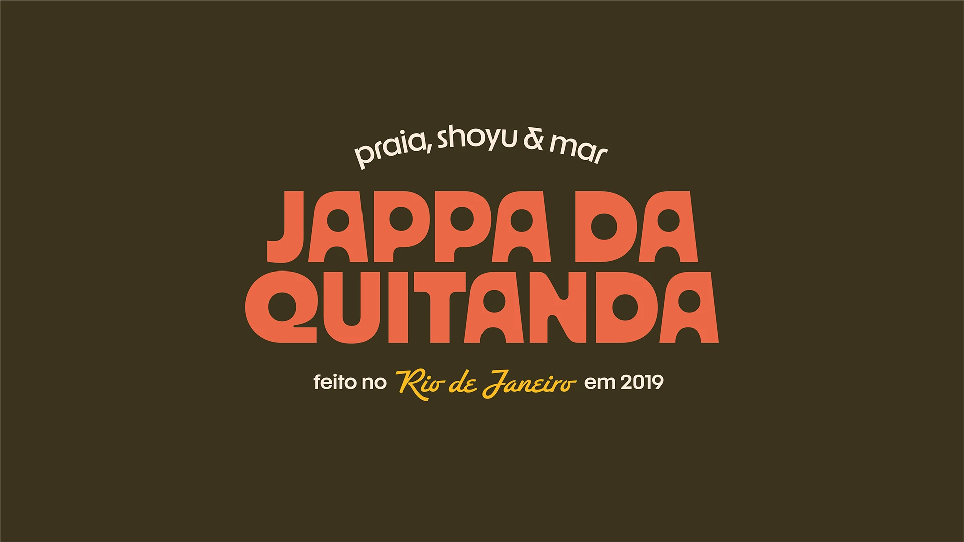
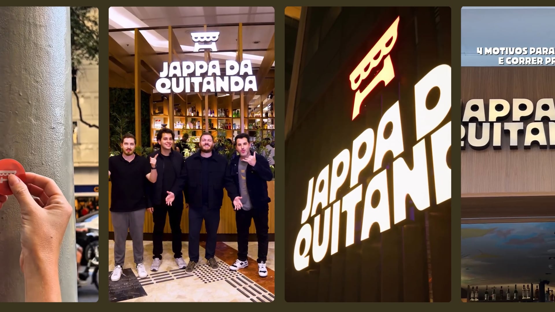
Jappa da Quitanda — Where Japan meets Rio
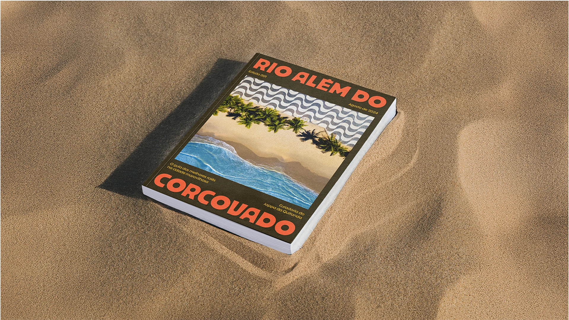
Born in Rio de Janeiro, Jappa da Quitanda reinvented itself as a premium Japanese restaurant with the spirit of an à la carte experience. The challenge was to express this evolution through a unique visual identity—one that communicates sophistication, quality, and a subtle sense of Brazilian warmth, without losing the easygoing attitude that made the brand beloved from the start.
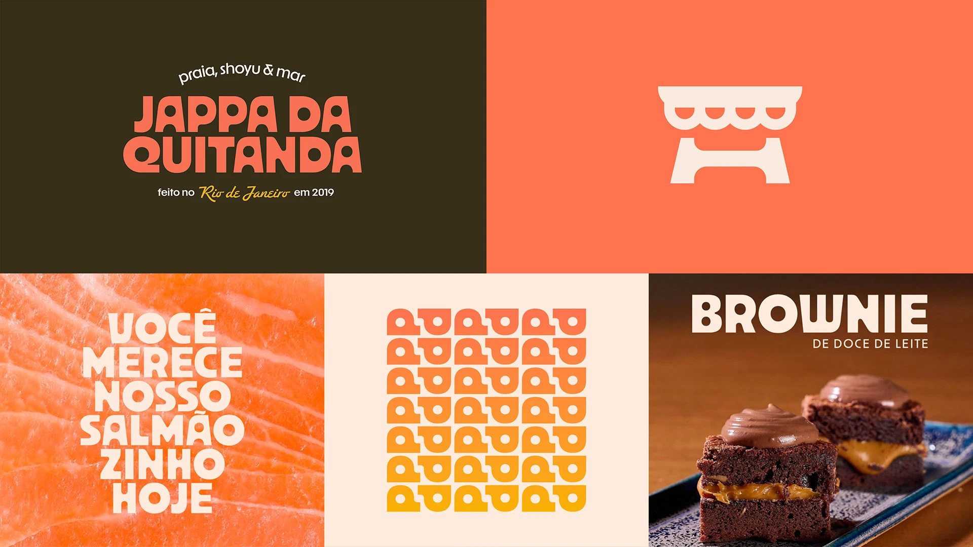
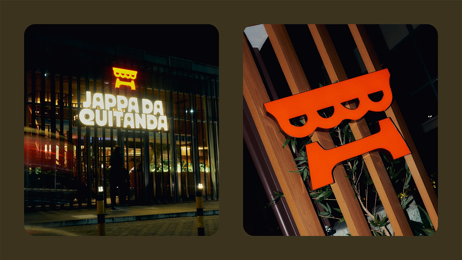
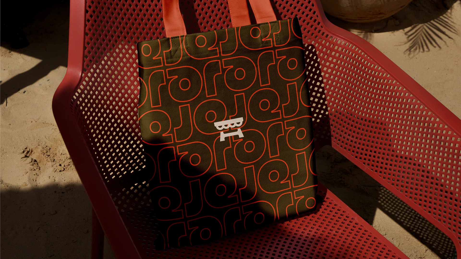
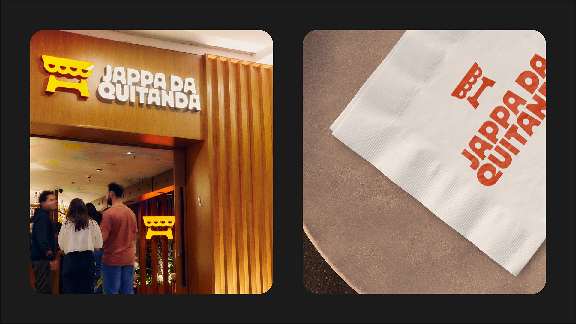
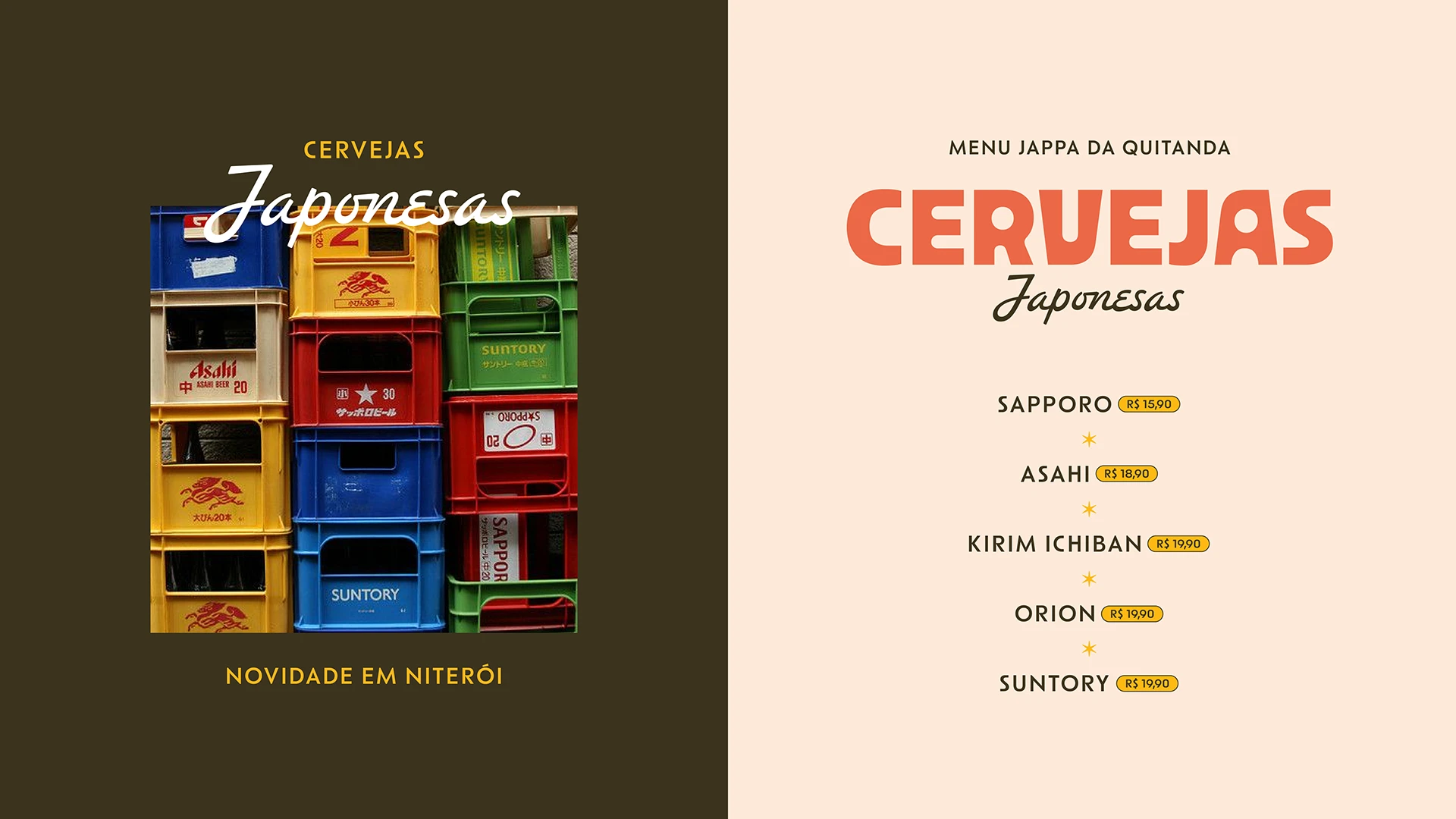
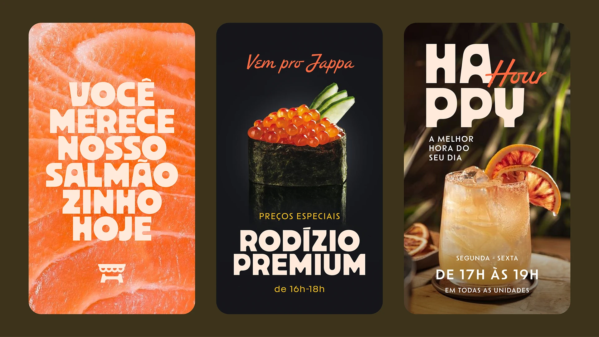
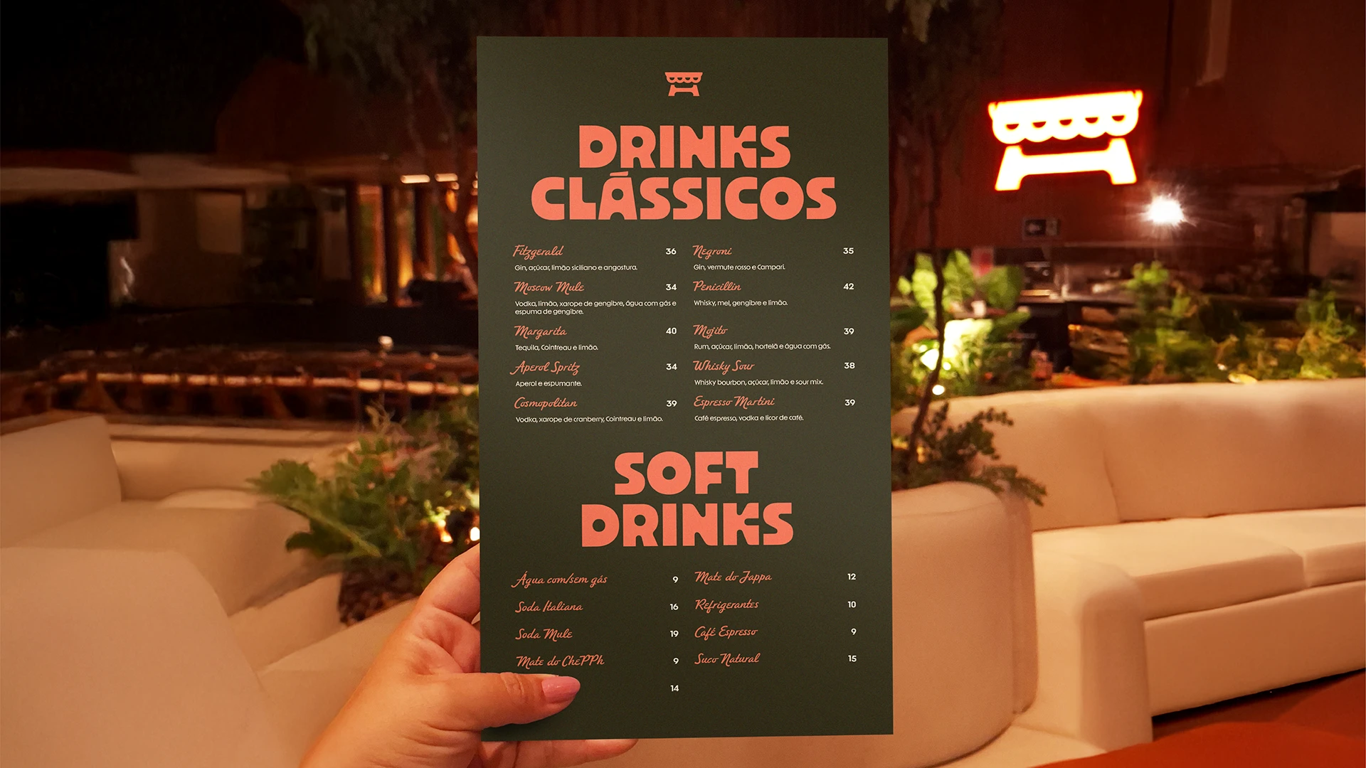
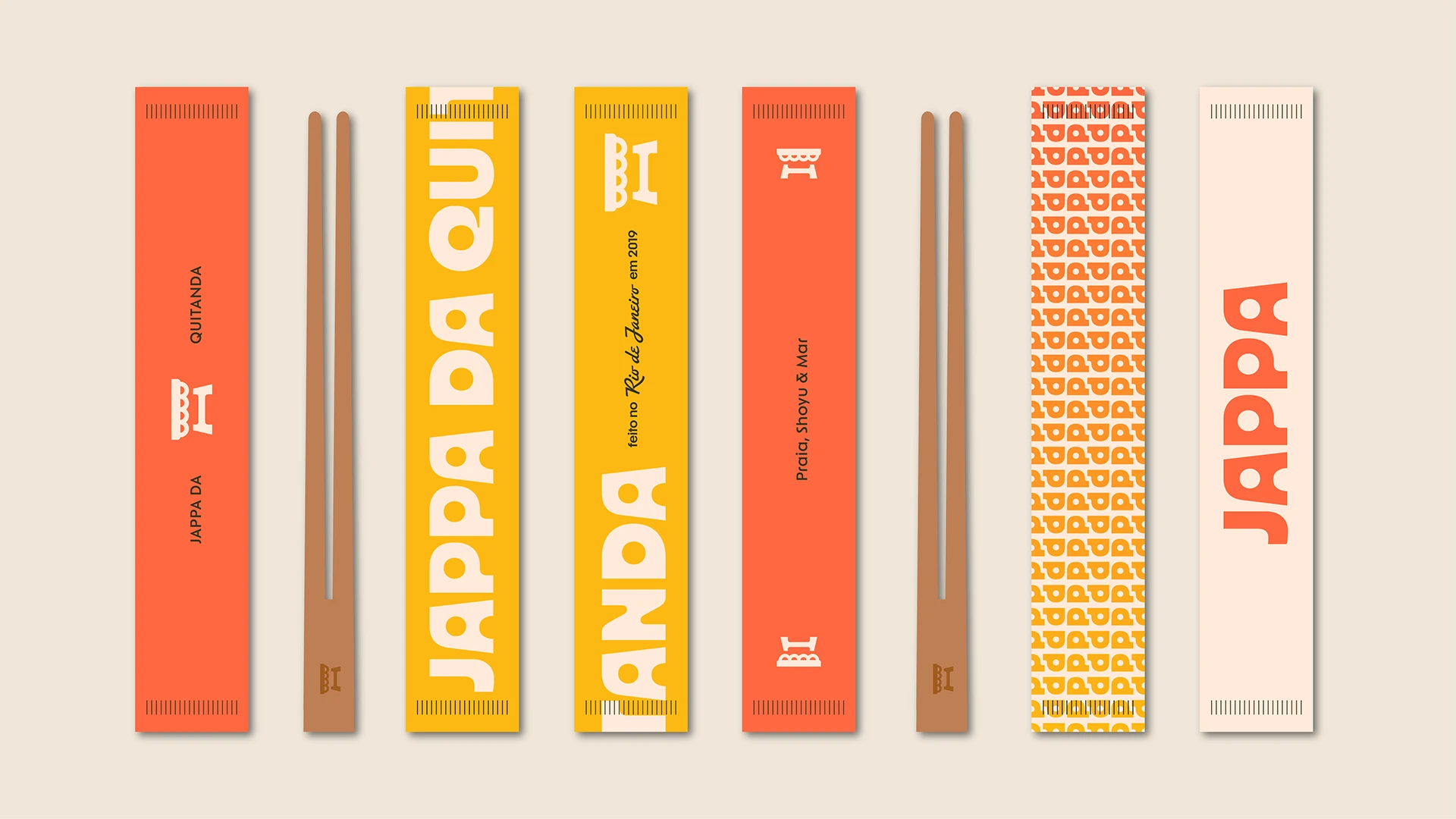
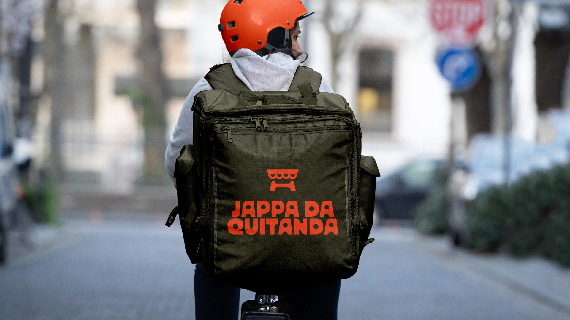
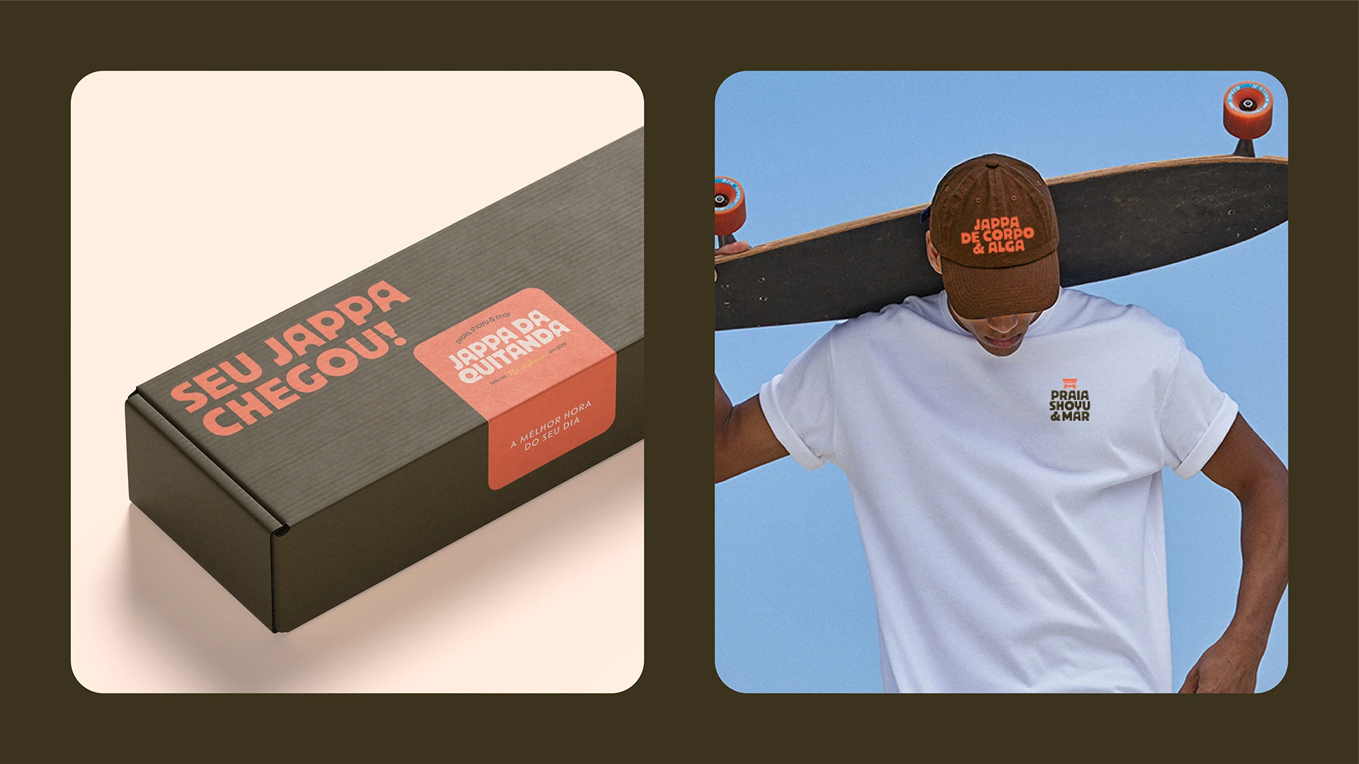
We created a comprehensive branding system that extends from brand strategy and tone of voice to color palette, graphic language, and real-world applications. Every element was designed to balance refinement and approachability, mirroring the restaurant’s elevated yet unpretentious atmosphere.
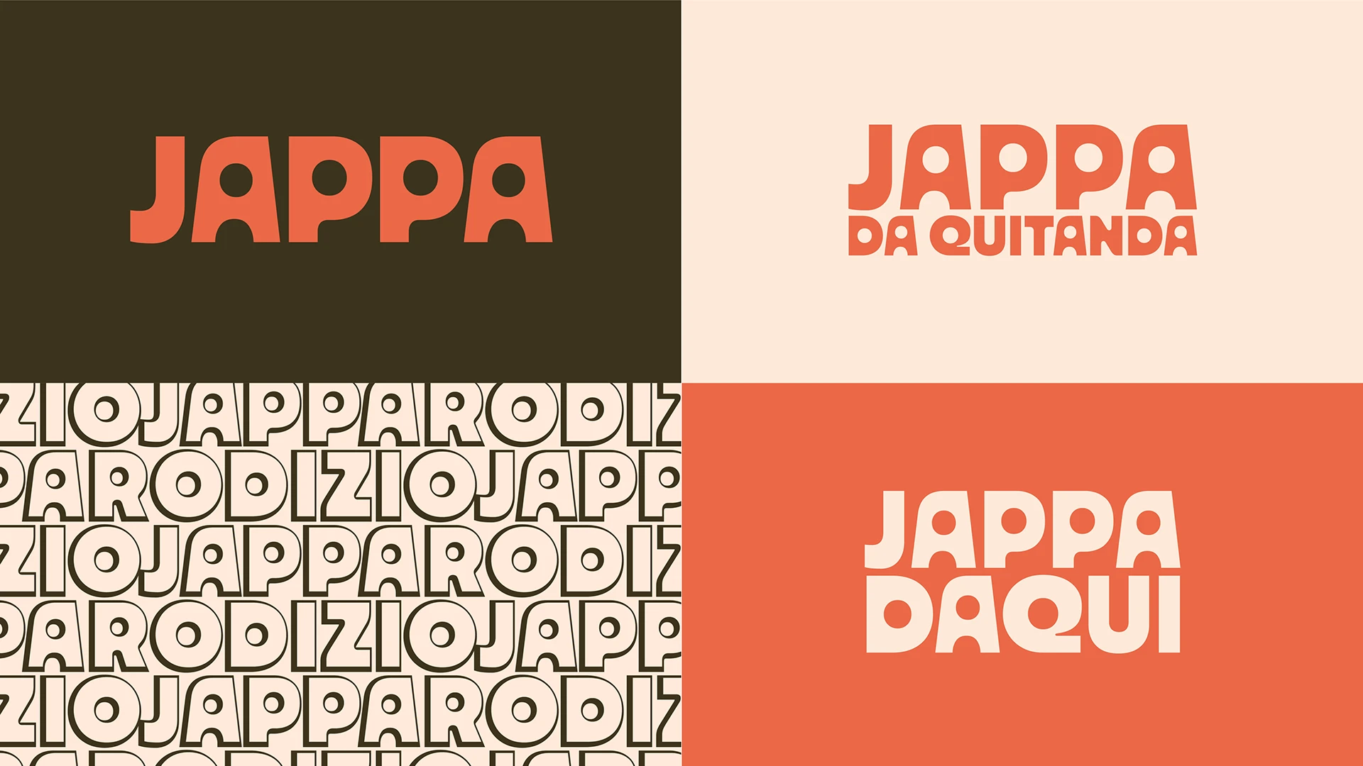
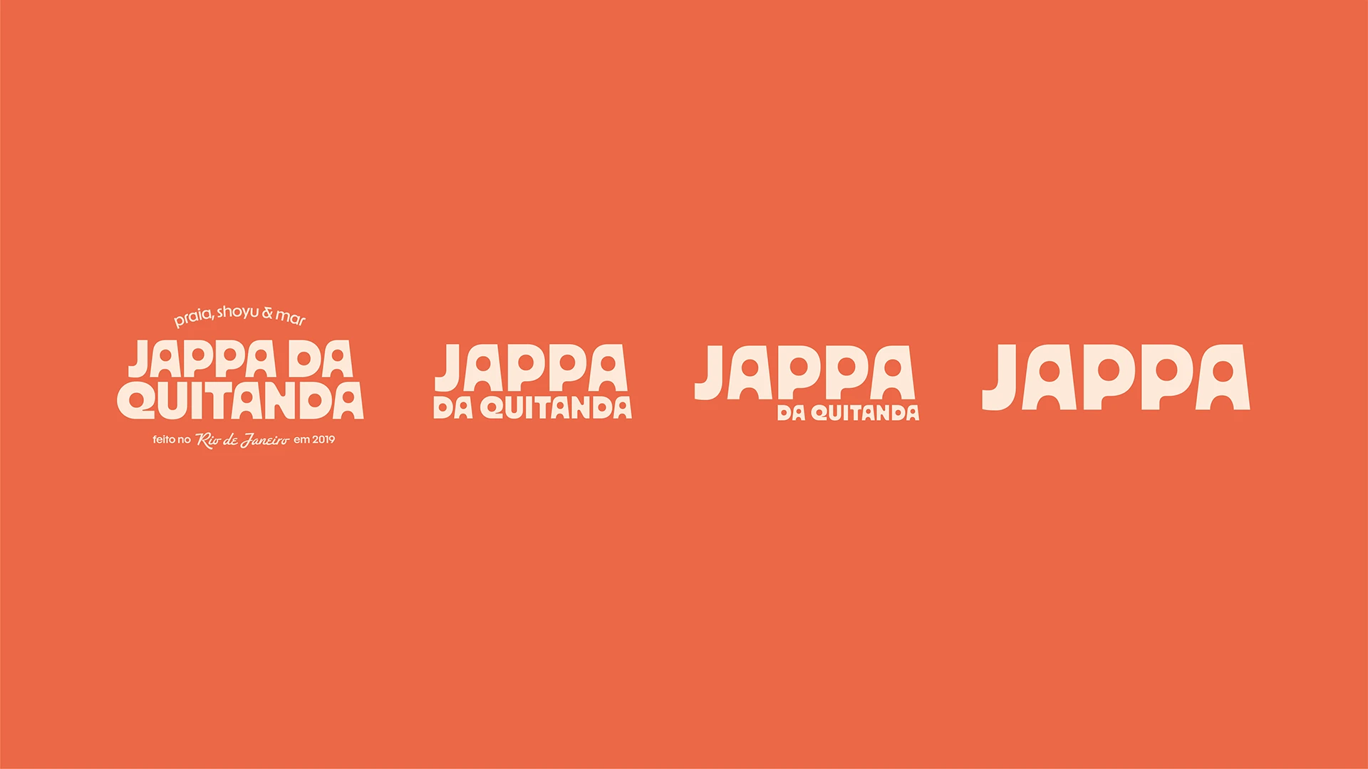
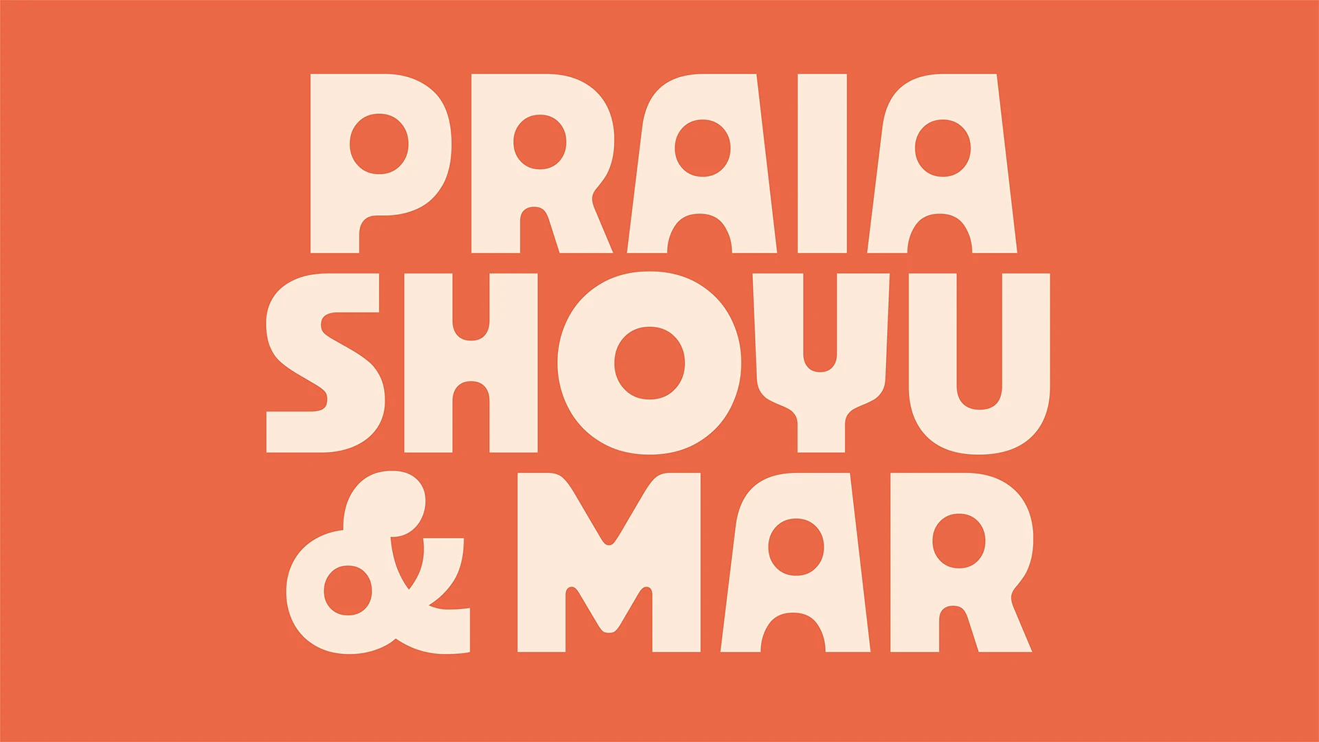
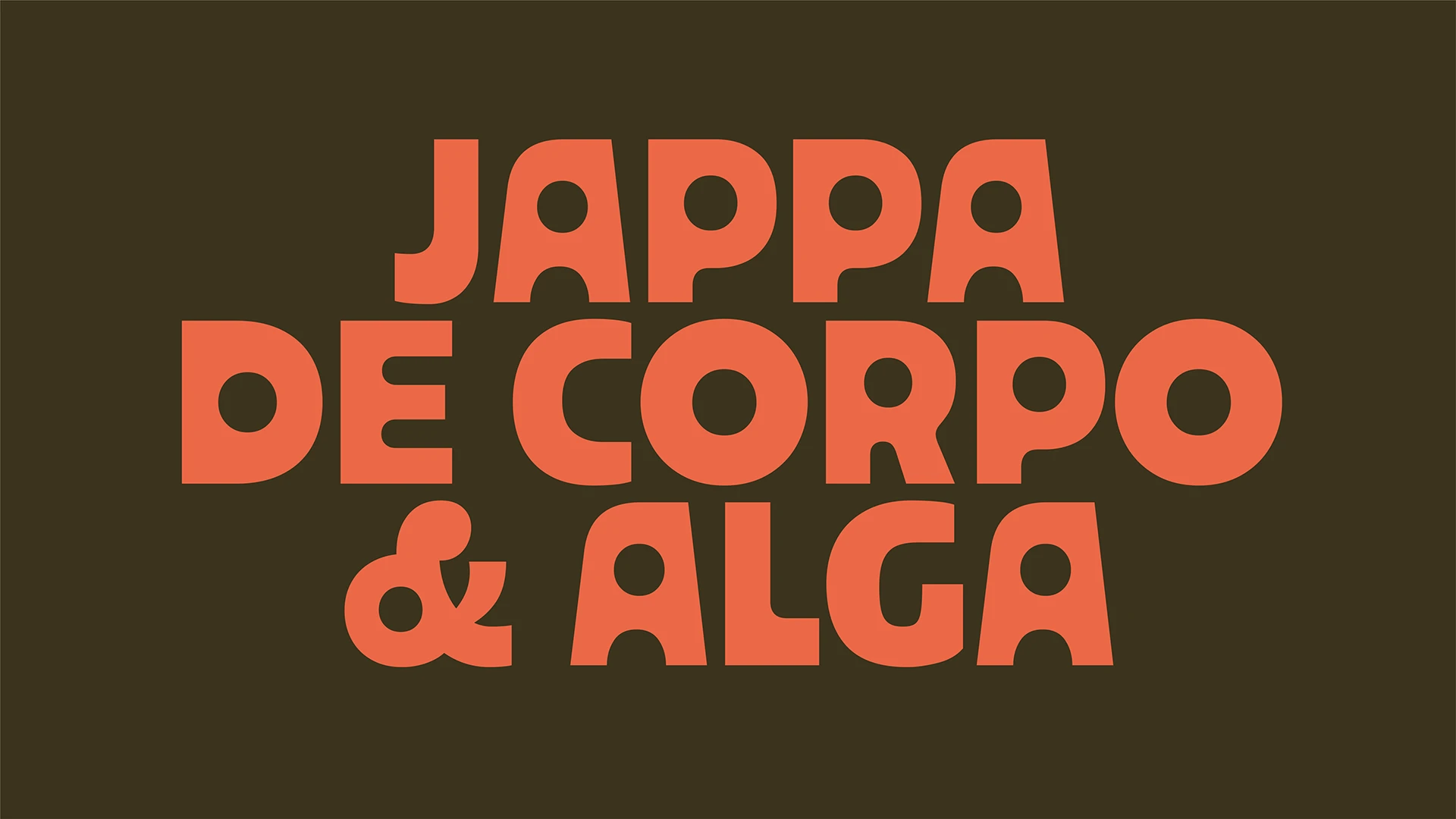
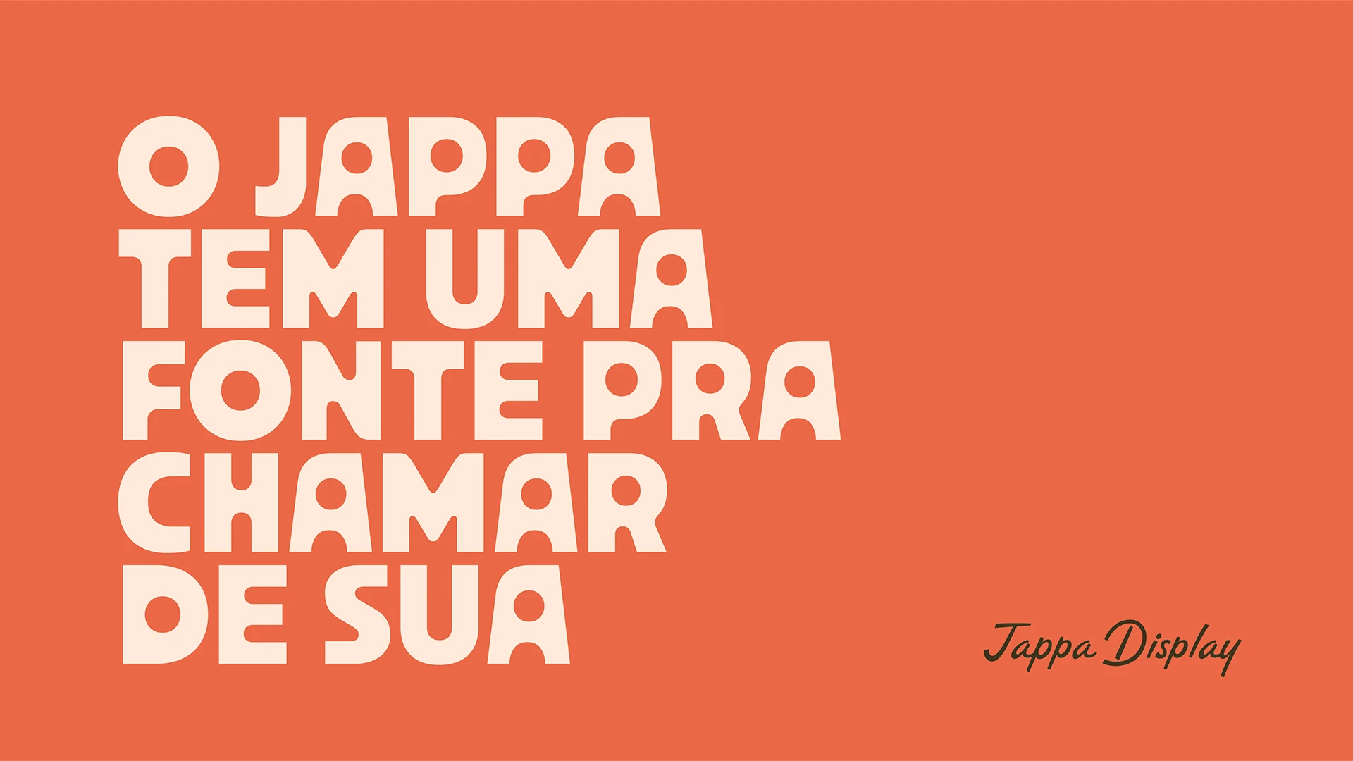
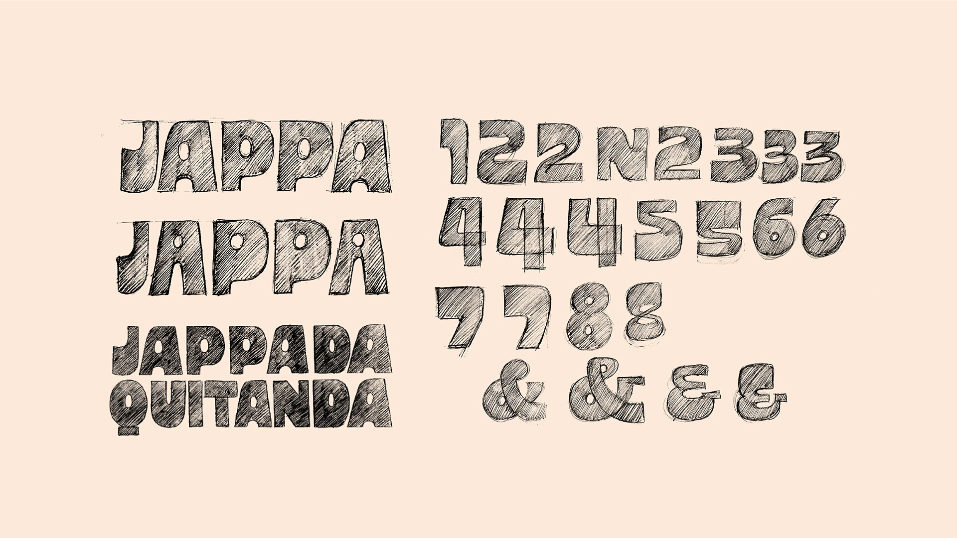
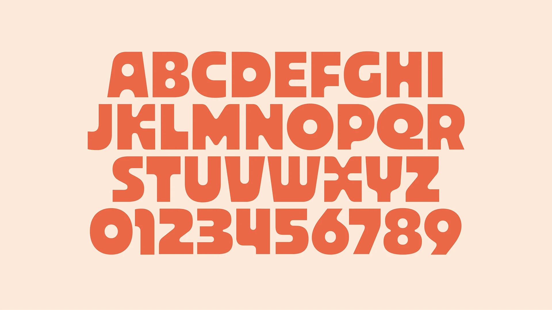
At the core of the identity lies Jappa Display, a custom typeface that embodies the brand’s personality. Its bold and affectionate design creates instant recognition, acting as Jappa’s visual signature across every medium. Circular counterforms give rhythm and flow to the reading experience—echoing the energy of a vibrant dining space—while its generous weight ensures clarity at any scale. It’s a typeface that bridges Japan and Rio, blending precision and emotion with freshness, humor, and authenticity.